
Warren Comics?
Was it possible to have a lifestyle based on Warren Comics?
I think I believed this was actually an option – and an option worth pursuing – back in the ’70s.
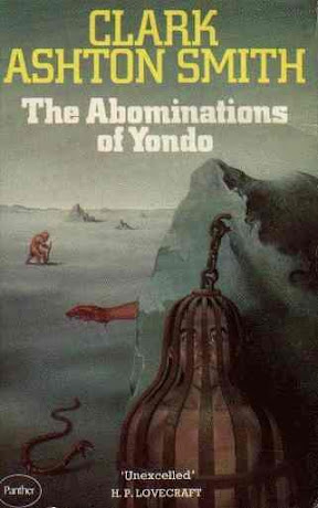
The infamous Comics Code Authority prevented regular comic books from having too many explicitly horrific or violent elements. Mad got around the Code by ceasing to be a standard comic book and becoming, instead, a black and white “magazine” that wasn’t subject to the Code and its censorship. Publisher James Warren used this approach to launch his own horror “magazines” in the the mid ’60s. Inspired by the success of the earlier “EC horror comics” of the ’50s, and using some of the same artists, these magazines – Creepy, then Eerie, and later Vampirella – often had the best stories and art of any comics then being produced by anyone.
I loved the Warren Comics with nothing less than feverish intensity and I collected as many of them as I could find. I kept them in a huge stack in the desk in my room and read them over and over again. Each month I would haunt the local newsstand looking for new issues. And, best of all, I would send away for related merchandise from the ads in the back of the comics. Unlike other comics, the “Captain Company” sold some great stuff and many high quality books on graphic art and comics.
The Warren Comics featured art by some of the best of the people in the comics “mainstream” – people like Steve Ditko and Neal Adams – but they also had some folks from the underground realms too – Vaughan Bode contributed some fine covers and, of course, Richard Corben was also a favorite. I caught a letter to an early issue of Eerie from underground artist Jay Lynch and I know that Rory Hayes was also a fan. It always seemed to me that the editors at Warren just wanted the best work they could get. They would later. of course, start reprinting Will Eisner’s The Spirit.
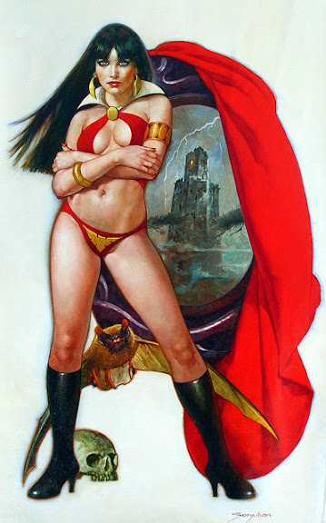
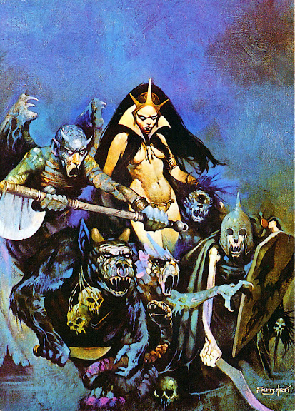
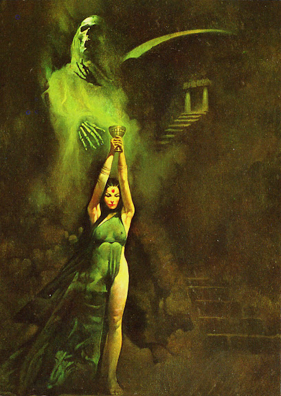
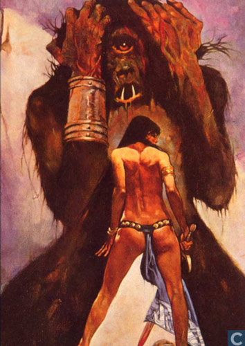
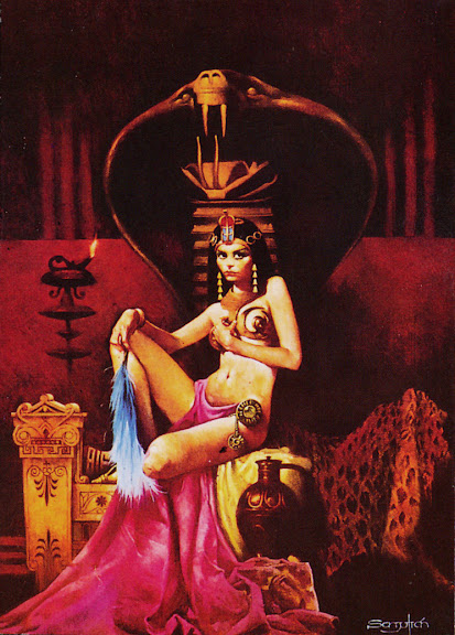
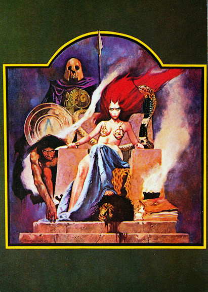
While in Paris, I read the first 30 issues of Eerie (on my Nook) and got reacquainted with these comics again. The Warren books all went through a series of highs and lows – a periodic cycle in quality I was previously unaware of. The earliest issues were terrific, followed by mediocrity and reprints, then followed by a surge of new material from foreign artists – first those from the Philippines and later from Spain. Some criticized the excessive use of the Spanish artists, but that was the period when I read the comics and they had, I came to see later, a profound effect on me. Frank Frazetta, deservedly, gets a huge amount of attention for his work with Warren – as he contributed painted art for their covers that has become iconic. Nevertheless, I think that their other artists deserve a second look.I know it’s somewhat hypocritical for me to dismiss Boris Vallejo and worship Sanjulian (the artist featured in the illustrations in this post), but the heart wants what it wants.
Originally, the Warren magazines were all about horror, but as the ’70s wore on, they became more erotic too. After all, when you don’t have to worry about censorship, why not push the limits? As a boy in Junior High, I – obviously – thought this was a great move. My dream landscapes turned into smoky seraglios filled with these women.
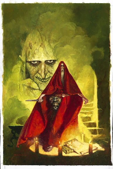
I noted, too, that many of the early Warren comics featured “Sword and Sorcery” motifs and themes. This can be seen as yet another source of inspiration for classic D&D too.
4 responses to “Warren Comics?”
Leave a comment

What I’m Playing…

What I’m Using…

What I’m Reading…

What I’m Studying…
What Inspires Me
What Inspires Me

I think you’re perfectly justified in dismissing Boris Vallejo in favor of Sanjulian. Sanjulian’s able to depict humans with other body types than “modern bodybuilder” ferinstance.
Thanks for your comment.
You had me at Warren Comics. I agree with all of your points on this. Very cool little entry! Keep up the good work!
Thank you for your kind comments!