
FRP Art
The art and illustration used in role playing games is, as it has probably always been, a contentious subject. Everyone has their favorite icons and it’s going to be hard to find 100% agreement anywhere. That said, the art and illustration issue still needs to be addressed.
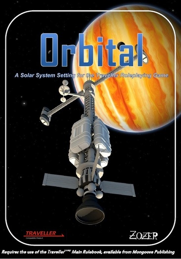
As I reviewed recent Traveller products, like Zozer Games’ somewhat-ballyhooed Orbital, I began to shudder at all the use of Poser and Photoshop-type artwork. It is, sadly, ubiquitous in the current OSR Traveller scene. The art produced for the Mongoose Traveller series is, at best, forgettable and, at worst, lamentably boring. If it wasn’t done using a cheap computer program, then its total lack of any discernible charm or personality indicates that it might as well have been.
Is this really the best we can expect?

The Traveller scene, of course, used to have some of the very finest artwork in the FRP world. Dominated by the work of the Keith Brothers, who seemed to write and illustrate just about nearly all the Traveller products for every company, I feel that looking at their work alongside the new, and uncritical, dependency on computer artwork we so much of now renders the comparison even more egregious and disturbing. When we contrast the beautiful cover art of some of the old issues of the JTAS to the stuff appearing these days, it’s impossible to concede anything but a serious decline in quality. Where, as I asked on Facebook, are our new “Keith brothers”? Who today is producing anything like the artwork of William H. Keith, Jr.? The computer stuff we see all over the place, especially in the fan community and the Traveller small press, is just not cutting it.

Is it because people have simply lost the skills to do these kinds of paintings any longer? I suspect some believe that computer art “fits” Traveller because it seems more futuristic and “science fictiony.” But would anyone in the OSR really pass on one of these oil paintings in favor of more routine and uninspiring Poser art? Please. C’mon. Enough is enough.
The D&D scene is almost as depressing. After the explosion of the game’s popularity in the early ’80s, bad D&D artwork took on a miserable life all its own. If you could take some of the worst, most depressingly rote art found on the covers of boring heavy metal albums and third rate comic books, and run them through a cliche machine, you might get some idea of how hackneyed and ugly this stuff was – and is. The people at TSR obviously preferred this commercial looking dreck to the more charming, original, even idiosyncratic artwork done by people like Erol Otus, David C. Sutherland III, and others. The precipitous decline in the quality of art mirrored the precipitous decline in the quality of the game.

The OSR, at least, has celebrated Otus and he is making a bit of a comeback now. Nevertheless, the overly commercialized art still turns up in far too many OSR projects. It’s not as awful as the poser/Photoshop stuff in the Traveller scene, but it’s not great either.
Fortunately, the OSR does have new artists working in what I think of as the “classic” mode. Peter Mullen is who I am referring to. This guy is awesome and he totally gets it. As far as I can tell, his unique contributions to the OSR’s vitality as movement are inestimable. Zak S.’s illustrations for his own Vornheim are another great example of someone really innovating. His map of the city, found on the inside of the book’s DJ, is a truly great and memorable work of art. It’s right up there with the classical fantasy maps rendered by Pauline Baynes and others. Its sprightly design completely repudiates the formalistic and hackneyed trash that has taken over FRP art for the last 30 years. Despite these very positive signs there are, I feel, far too many people in the OSR whose sense of FRP aesthetics are more informed by the styles set during the 2D era and later. This is, of course, tragic.

My advice to the artists is simply this: take your hand away from the mouse and pick up the brushes and the pens. If you have already forsaken the screen and the pixels, then go back to the fantasy art done before, say, 1960 and see what inspires you. We need more people learning from Hannes Bok – and fewer influenced by Boris Vallejo!
What I’m Playing…

What I’m Using…

What I’m Reading…

What I’m Studying…
What Inspires Me
What Inspires Me
