
What is Good D&D Art? What Isn’t?
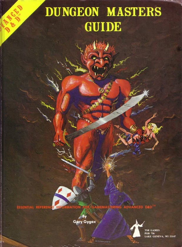
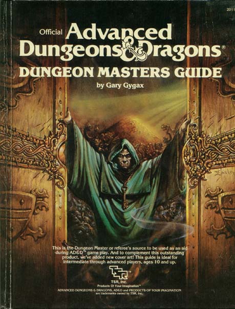
The art in D&D started going down the tubes the same time the game did. As the art in TSR’s products became more “professional,” it became more soulless and lacking. Gygax himself was a big part of this problem. He notoriously preferred the ugly, uninspired second edition cover of the DMG to the iconic first one.
Compare this:
To this:
As the art became more slick, the creative, vital part of the game started to flounder. No one saw D&D as something they could do on their own – or even do better themselves. Instead, it became yet another consumer driven affair. Kids didn’t make up their own campaigns, nor did they even aspire to. Instead, they scurried to buy the modules with the all the pseudo-Boris Vallejo artwork. This situation went from bad to worse – culminating in the philistine abominations of the art in 4E. Rather than being, strange, liberating and different, the art in the game, and the game itself, became routine, boring, established, and sclerotic. What was was liberating and new, became confining and old.
The OSR has, thankfully, worked to turn this situation around. Some of the best artwork in all of gaming, these days, is the stuff associated with OSR products. But, more than that, the OSR has searched further and further afield for artistic inspiration to inform its gaming and ideas.
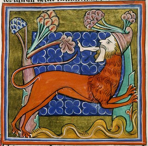
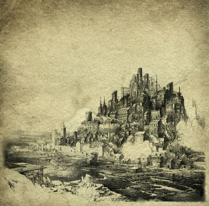
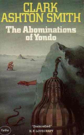
Here are some of the pieces that I have found inspiring lately.
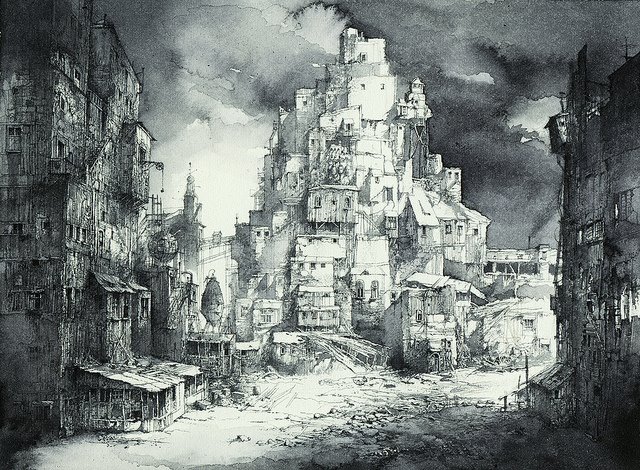
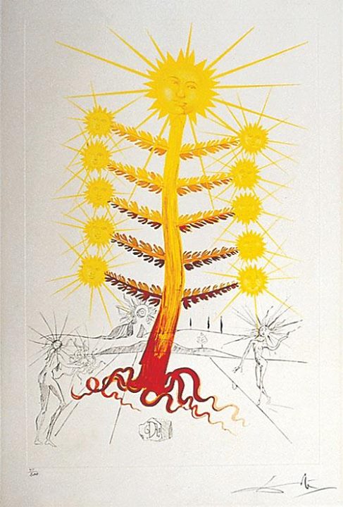
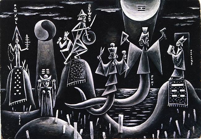
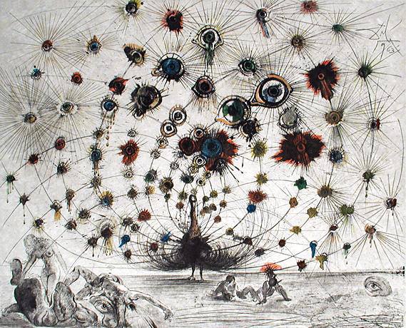
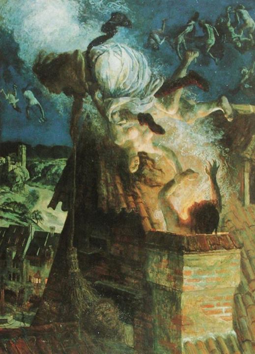
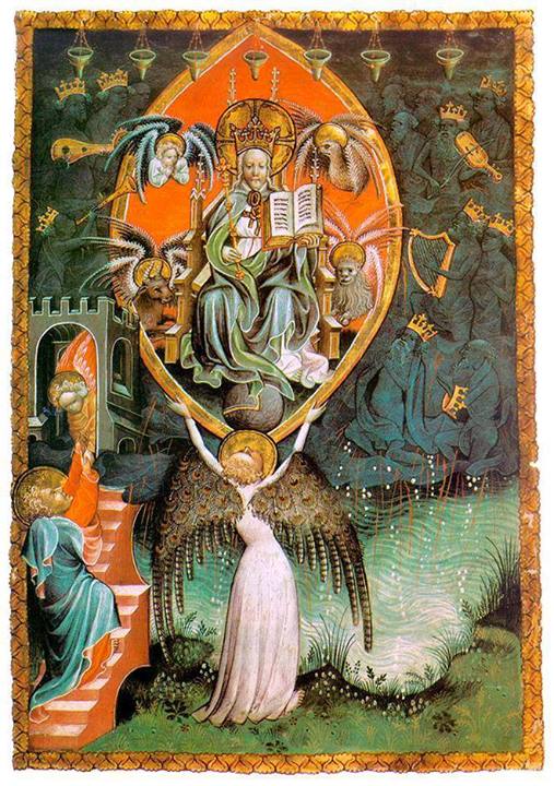
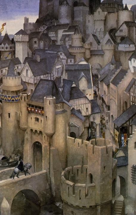
Believe it or not, but I can find a place for each of these things – right on the old Outdoor Survival map!
8 responses to “What is Good D&D Art? What Isn’t?”
Leave a comment

What I’m Playing…

What I’m Using…

What I’m Reading…

What I’m Studying…
What Inspires Me
What Inspires Me

I think the progression just came as a result from more defined genre expectations. D&D 4E is a perfectly natural progression in terms of art. While I think the OSR has certainly been a “back-to-basics” and sneered in a new era of DIY, that initial magic is gone. At least in the sense that new things will be produced with no or little precedent.
Well, we’ll see. But the prospects for breaking free from the dictates established by TSR look pretty good to me.
Where are those pictures from? I’m particularly interested in knowing more about those more symbolic images (1, 5, 6, 7, 8)
Also, I kind of disagree with you a little bit. The old DMG demon cover looks like it got straight out of elementary school art class (in the bad way). Also, 3rd. and 4th edition D&D art is mostly crap just because it’s badly drawn, cheapass photoshop shit 😀
While the original DMG art might have appeared amateurish to you, this precise quality encouraged many people, and kids in particular, to be creative. The creativity of the community fell off in a direct relationship to the “professionalism” of the art.
We can agree to disagree about the cover. for me, it’s iconic. I’d love to get it on a t-shirt, and I’d never want to wear the second cover that way.
@Nestori: You can drag and drop an image onto Google Image Search to search for it.
I don’t mind the second DMG cover, but I really like the first one.
I was looking at the “Ennie” awards nominations and believe it or not, there is a category for “best production values”, which seems to me like a symptom of the gamer-stockholm-syndrome of “we get slick crap so we like slick crap” or something. Which may or may not be relevant to your post, but seems like it might be to me.
Back in the early 80’s D&D felt like being in a punk band for nerds, by the beginning of the 90’s it felt like any corporate product due largely to the high production value art. The more defined it became the less attractive it was.
The Encounter on the DMG wasnt with a Demon its with a Efreeti guarding the fabled City Of Brass!!!.